[This article originally appeared on Digital Web Magazine in 2007, alas, their website is now defunct. I am reposting it here so it doesn’t disappear.]
Although a computerized version of card sorting might help you to quickly analyze the results, it is much better from a user point of view to sort physical cards. Users enjoy the tangible aspect of sorting cards; they like to move the cards around, scribble on them, chew them, and throw them away. Don’t deprive them of this feeling.
Ruth Stalker-Firth, Digital Web Magazine
Everyone loves a game of cards.
I was raised playing Whist for pennies and matches. Whatever the stakes, we ten-year-olds would play for hours, peering over at our opponents while trying to make sense of the random hand we had been dealt. And in exactly the same way, card sorting is appealing to users. As humans, our minds prefer to absorb information in chunks, and we subconsciously look for and remember links, groups, and other patterns in the information we see. Because of the way our minds work, it can be satisfying for users to sort through a stack of cards—in the same way that some people enjoy rearranging their CDs or bookcases to make it easier to find a specific tune or book.
Often, clients come to us with their website in a tangle, overwhelmed at the prospect of tidying it up, especially if it is a large website with numerous stakeholders and seemingly random strands of information. For the usability consultant,card sorts are a powerful tool, and a nice alternative to simply instructing your test participants to “give voice to your stream of consciousness while I watch you interact with this website.” Call in some users, give them a stack of index cards with content subjects written on them, along with a list of headings from the client’s site—“Business and News,” “Lifestyle,” “Society and Culture”—and see where users think “How to floss your teeth” should sit. Users can, and do, untangle seemingly impossible spaghetti structures by identifying new patterns, as well as finding a home for content or categories that don’t seem to fit anywhere.
Using a card sort gives us an insight into how users expect a site to work, and where they would look for specific information in a site. The advantage of the card sort is that, as well as sorting out navigation problems, we are also able to understand users’ mental models, which leads to better information architecture. Users are busy people who wouldn’t normally give this much time to analyzing websites. If a site is too convoluted to use, most users will click away as fast as they can. Redesigned sites based on card sort results will encourage them to stay.
Open or closed?
There are two ways of performing cards sorts, open and closed.
- In an open card sort, users are given a series of cards without any category headings or indication of how to group the cards—they make up their own categories and names as they go.
- In a closed card sort, users are given a list of categories, or headings, under which to place the cards.
I use a semi-closed card sort; start the users off with several headings, and tell them to ignore, add, or rename them as they see fit. Giving users some category names to begin with makes the task seem easier to start—then, once they are comfortable with the task, they can start to consider category headings. Headers can also suggest a sense of context which is otherwise missing even if you explain to them what the purpose and aims of the site.
Where and when?
Traditionally, card sorts are a lo-fi approach and don’t need any technology, so they are easy to transport—you can go to the users, or the users can come to you. All you need is some cards, paper, and double-sided sticky tape—just like any self-respecting Blue Peter project.
Card sorts are most useful at the beginning of a design project, when there is some idea of what content should be included, but not how or why. They are also great at the start of a website redesign, particularly on sites where the volume of content has spiraled out of control.
How much time have you got? One-on-one or groups?
The decision whether to perform your card sorting sessions as one-on-one or group activities really depends on the amount of time for which your client is paying you. Use your time wisely.
Bringing ten users into one room to card-sort together, even if you are lucky enough to enlist the aid of a colleague, might not allow you to hear everything that everyone has to say about each card—but, how much do you need to hear? They will, after all, leave behind a layout, and your analysis will identify trends.
Getting the users to card-sort in pairs is useful, as it reduces the number of conversations you and your colleague need to listen to, as well as the number of cards to analyze afterwards. It is also a good way to open up conversation about the site content—in pairs, users are more likely to begin debates about the terminology they have in front of them, while you, the consultant, can walk about the room capturing these nuggets of information and exploring them further as and when you feel necessary. Ten card sorts is a good number to run, so if you do use pairs you will need twenty participants, perhaps running two card sorts over two days.
Sometimes, during a normal usability testing one-on-one session, you may discover problems with the site navigation, and it can be useful to run an impromptu mini-card sort when this happens. Give the user a Post-It pad and a pen, and ask him or her to write down category headings they would find more useful, and then the content which would go under each heading. Devoting fifteen or twenty minutes of your one-hour session to tackling the problem when it occurs can help you obtain more useful results over the remaining seven or eight sessions you have left. In turn, this may trigger the realization that there is an information architecture problem, and perhaps a card sort will help with solutions.
Setting up a card sort: A few points to consider before, during, and after
Before
- Context: In order to overcome the lack of context, putting large screenshots of the website on a wall nearby can help users have some idea of what they are helping to design, without being too influenced by the current layout.
- Use a maximum of one hundred cards. Too many cards can be overwhelming for users (and for you during the hours it takes to analyze all the results). With larger websites, try and give a balanced representation of the types of information the site has to offer. Give each card a unique identifier, numbering them one through one hundred. You will need these numbers if you later analyze the results using a computer.
- Use DIY business card packs. Avery sells perforated business card packs which have eight to ten cards on each sheet. Use one of their downloadable templates to type your content on each card, print them out, and then punch the cards out. Business cards are a nice size to hold and manipulate. Printing labels and sticking them on cards bought from a stationary shop (or out-of-date business cards) is another quick method. (Don’t do what I once did, and print your cards on a single sheet and then cut them up—my hand is still aching!)
During
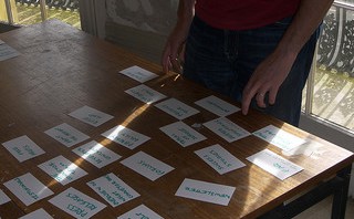
- Put the cards on large sheets of paper on the table so that users have an area to organize. Give them thick marker pens so they can doodle on the paper and draw around their groups of cards.
- Some users might prefer to stand up so bring tape or Fun-Tak so that users can stick the cards to the paper, and stick the paper to the wall.
- Always have a couple of spare sets of cards. Accidents do happen. Users will also need spare empty cards and felt-tip pens so that they can make their own cards and headings.
After
- Discarded cards are just as useful to us as ones that the participants found easy to sort. If users are creating a great big pile of uncategorized cards, this is an important result: There is something wrong with the site content.
- Once users are happy with the content tree they have created, give them some glue or tape to stick down their card organization. In this way, you preserve the order and the groups/categories they have chosen.
- If you don’t think you need to record the precise layout, give the users elastic bands and have them collect together each group and put the piles in large envelopes. (During analysis, though, you may find it easier to have the cards all spread out in front of you, so that you see the big picture as well as the fine detail.)
- Bring a digital camera and take pictures of each card sort result, as well as your helpful users having a great time—a picture of a group of users sorting through cards is great to show to your stakeholders when you are explaining what you have been doing.
Analysis: The big (and fine detail) picture
Although a computerized version of card sorting might help you to quickly analyze the results, it is much better from a user point of view to sort physical cards. Users enjoy the tangible aspect of sorting cards; they like to move the cards around, scribble on them, chew them, and throw them away. Don’t deprive them of this feeling.
A top-level analysis can be carried out just by looking at the layout of the sorted cards. Patterns will emerge. For example, “How to floss your teeth” may be grouped with other how-tos under a “How to” heading on the top level, instead of under the “Health” category where it originally lived. Alternatively, users may have a pile of cards which don’t fit anywhere—this can indicate the need for a different information architecture, or a reduced amount of site content.
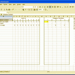
Spreadsheet analysis
For a deeper analysis, use a spreadsheet. You can use a spreadsheet to:
- Store the results of the card sort without having to keep referring back to the cards.
- Interpret results using tables and graphs.
Enter the name of the card and its number, and then number each category. If the users have created new categories, add those too, and then enter the data.
A more detailed tutorial on how to set up a spreadsheet to analyze a card sort can be found at http://www.ruthstalkerfirth.com/card-sort-analysis-using-a-spreadsheet.
Trends
Trends to look for during analysis are:
-
How often a card appears in a category.
If the card appears consistently in the same category across users, then that is where the content should live on the live site.
-
Categories which contain the same content across users.
If categories—either user-created or original ones—are appearing in several sets of user-sorted cards, then this category and its content should be used on the site. For example, if the majority of users put “How to floss your teeth” under a newly created “How to” category instead of the supplied category heading “Health,” then during the site redesign, perhaps a “How to” section should be introduced.
-
Differences between category contents.
If there are a lot of differences in the contents of a particular category across users, then you might have to relabel the category so that it is clearer what content it should contain, and so that it reflects user expectations. Looking at the categories users have created can help you with the new label.
-
Content which has caused problems with users, because it appears in many different categories or user-created categories; or it is impossible to categorize.
The easiest way to solve this headache is just to get rid of the content. Less can be more, especially if the overall message of the site is getting lost. Unfortunately, clients might want to hold onto their content—if you can’t win this battle, cross-referencing content so that it can be found regardless of which heading users look under can help.
-
New categories which several users have created.
If users are not categorizing any content under a predefined heading, such as “Business and News,” but are instead creating a new one such as “Technology” under which to store content, then use this new category.
-
Ways users categorize information: by subject (“health”) or by process (“how to”).
Again, careful cross-referencing can help solve this problem. Users should be able to find “How to floss your teeth” whether they begin in “How to” or “Health.”
-
What content users feel should be at the top level (main menu).
If a new top level category is emerging across several users, then this should be considered in the redesign.
If you still can’t decide
If the results of your card-sort feel inconclusive, more user testing can complement the results you have generated, particularly if you concentrate on the content and categories which users found confusing to inform the next batch of user testing.
Presenting results and managing expectations
Like many usability techniques, card sorting can be viewed with suspicion by some, which can make presenting your results an uphill struggle. If the results are not what the stakeholders want to hear, one way to prepare them and manage their expectations is to get them to perform a mini-card sort during the debrief session. Encourage them to look at each others results and where they place their cards. If the stakeholders themselves have different ideas about how the site should be structured, then it follows that your answers, as the usability consultant, won’t satisfy them all. Hopefully, individual stakeholders will realize that they may have to think about what their aims are for the website.
Whatever happens, don’t panic—there is always an emerging pattern.