 Posted by
 The World Wide Web (W3) is a wide-area hypermedia information retrieval initiative aiming to give universal access to a large universe of documents.
Tim Berners-Lee
[Part 1 of 7 : 0) intro, 1) story, 2) pictures, 3) users, 4) content, 5) structure, 6) social media, 7) evaluation]
Tim Berners-Lee used this description to describe the Web, 25 years ago, on the first website of his newly created World Wide Web. In 2014, the world’s Internet users surpassed 3 billion or 43.6 percent of world population, inadvertently, creating digital culture. But Berners-Lee’s words are as relevant today as they were back then. The Web was always intended to give universal access to a large universe of documents.
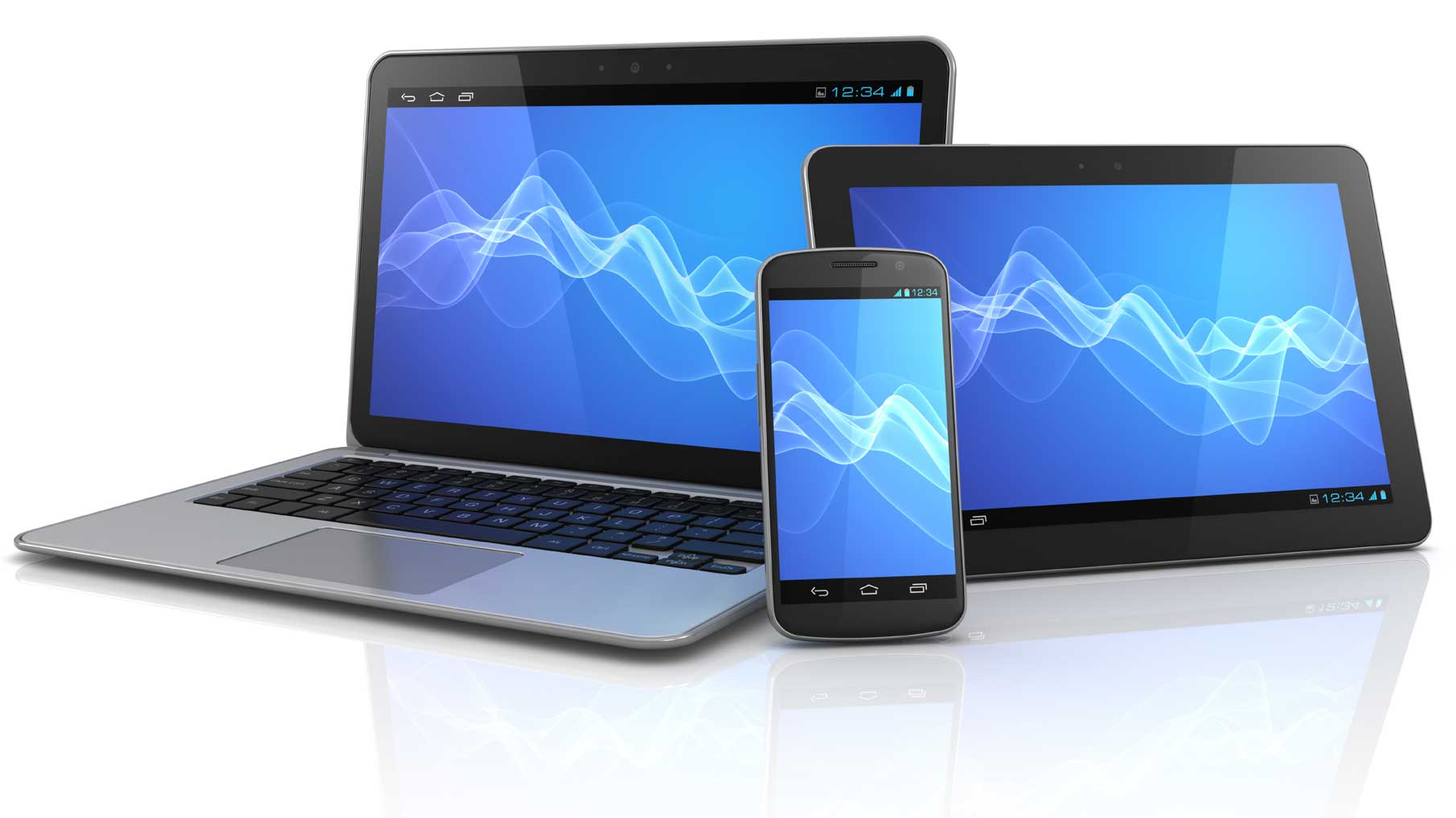
Alongside documents, we have the Internet of Things with devices passing information to each other to create ambient atmospheres. And, we have the Internet (of people) which compresses time and space so we can communicate instantly all over the world regardless of time zone: To shop, to make money, to make friends.
Until recently, we would only do this via a website, but whether we are reading, or chatting, or creating art, our main means of communicating is using words. And so, whatever else we think a website is, or can be, a website is words on a page which communicate a message, a story, or instructions.
For a long time designers were very conscious of words and used the idea of a newspaper as to how a website should be designed. We had above the fold, headlines, and images to break up the text making lots of websites look like newspapers. We controlled the layout and told each browser exactly how to display our website design.
This worked well because humans like to recognise things, and can transfer their knowledge of one thing (newspaper works like this) to another (ah very similar to a newspaper, this website works like this) as well as being storytellers who, whilst feeling happy with certain plots or layouts, like to be surprised and amazed. Apple calls this design approach discoverability, which recognises that we are always looking for the next thing.
Humans are motivated by needs and are constantly looking to satisfy them. This is reflected online by us getting interactive with our words and making services available: to buy books worldwide, get food delivered locally, or check our bank accounts, before moving onto the next thing.
So, it may seem that websites today look and feel very different to Berners-Lee first website. But, they aren’t. No matter what you offer on a website to captivate your users and to make your design shine, the fundamental purpose of your website is to communicate the content – information or a service – which we do using words.
All websites look the same
Web designer, Dave Ellis says that most websites are starting to look the same, especially those ones done by web design companies advertising their web design capabilities.
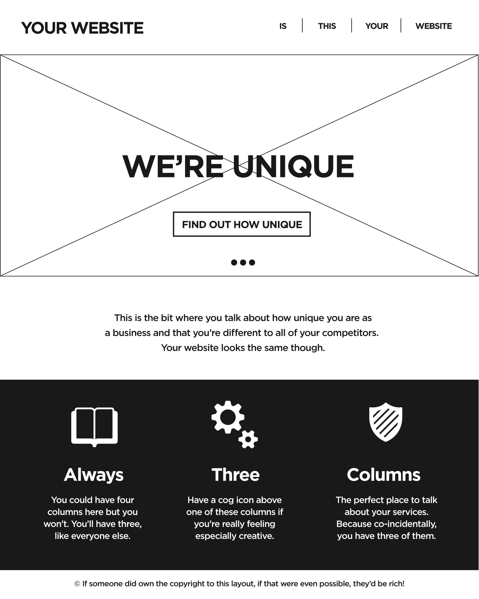
UX designer@timcaynes went so far as to collect some of these same looking home pages together.
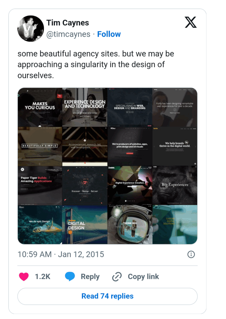
When laid out side by side they do look, interestingly enough, very similar.
They are following, according to 99designs, one of the top trends of 2015, which is: make it big, others trends include circles in your design and animated storytelling.
But, trends come and go. Web developer Jeremy Keith reminds us in one of his great blog posts how JavaScript was quickly adopted for three primary use cases:
- Swapping out images when the user moused over a link.
- Doing really bad client-side form validation.
- Spawning pop-up windows.
Gah!
But, it is not just the trend of make it big which designers blame for the homogeneous nature of web pages. Many believe it is because of the mobile first design approach.
Usability guru, Jakob Nielson, in his mobile design course advises the designer to:
- cut features: eliminate things that are not core to the mobile use case;
- cut content: to reduce word count and defer secondary information;
- enlarge interface elements: to accommodate the “fat finger” problem.
But it’s not just space! Theoretically, mobile-first web design accommodates the most difficult context first. By removing convenient user assumptions: strong connection, ajax support. You have to get users to achieve their goals quickly and easily, which sounds great, in theory. But, the above list causes you to design very differently for a mobile than for a desktop and gives you different experiences.
This realisation has led to adaptive web design (AWD) and responsive web design (RWD). Both approaches design for different devices (e.g., desktop and mobile) whilst maintaining similar experiences.
RWD relies on flexible and fluid grids, and AWD relies on predefined screen sizes. RWD might take more code and implementation strategies with the fluid grids, CSS, and flexible foundations, whilst AWD has a streamlined, layered approach, which utilizes scripting to assist with adapting to various devices and screen sizes.
In practice though, this has led to AWD providing several websites on one URL: one mobile and one desktop, etc.
Cutting the mustard: Progress enhancement
Designer and web standards advocate, @Zeldman, says that there are 18,796 distinct Android devices on the market, and this will only continue to increase as technology gets cheaper and more widely available.
How do you design for this?
The BBC ‘s responsive team came up with cutting the mustard, which is about testing a browser for its capabilities before serving up all of the scripts which are going to create website behaviour and better experiences. This is similar to what Zeldman and The Web Standards Project proposed too back in the day.
However, do we need to have the same experience? Even if we all use identical websites we are having different experiences anyway because we are embodied and we see the world through our own particular lense of experience. If we add a different device to the mix, what does that mean? Nothing much, if users can easily do what they came to do.
An escalator can never break – it can only become stairs. You would never see an “Escalator Temporarily Out Of Order” sign, just “Escalator Temporarily Stairs. Sorry for the convenience. We apologize for the fact that you can still get up there.”
Seamless experience
Last year, facebook commissioned a study which found out that 40% of adults switch between devices, often web and mobile, to complete a single task. Nilay Patel, says that the mobile web needs to get much better in his article: The mobile web sucks and perhaps this is why.
But as Raj Aggarwal in Wired Magazine, says we need to understand what actions are best suited to which device and platform, i.e., desktop or mobile, and make it as easy as possible for users to perform those actions.
Mobile phones contain all sorts of extra functionality such as GPS location, camera, which is why many companies have gone for straight to app design instead of mobile web. This approach encourages users to switch devices depending on what they are doing. E.g., people use their Uber mobile app to find a cab, but are likely leave feedback on the Web.
Designers need to create a seamless experience between their web app and the mobile app which remembers where users left off. Modern sites such as Gmail, Facebook, Twitter, Yelp and Mint.com all do this as well as updating themselves which makes users feel secure. For, Aaron Gustafson has proof that we don’t control our web pages, because big companies are serving up ads and putting extra html and css into webpages as they deliver them.
Gustafson says that there is no way of controlling this, but says that we need to make the content we serve as good as possible in order for users to still achieve their goals,when some resources are missing or markup is altered. This is much easier to do with an app.
Great guidelines exist for producing accessible mobile apps, particularly clutter free logical text which can be read out by a screen reader. One lovely example this site gives is the Met Office’s Weather App. When someone uses the Met Office’s app, they want to know what the weather is going to be like today. They don’t need to see the sunshine and showers. Words which contain a description of the weather is enough:
Today twenty January two thousand and twelve (heading, screen reader identifies the text as a heading)
Cloudy with light rain eight degrees centigrade
Wind westerly eleven
sunrise seven fifty five
sunset sixteen twenty eight-Reading the Met Office Weather App, One Voice
Job done!
All a website needs to do is to give users the information for which they came.
If we compare this to Berners-Lee’s very first website, or get a screen reader to read Berners-Lee’s text for us, we may find that the experiences are very similar.
Content is key. If we design for content, we continue to give universal access to a large universe of documents and services and information, which, after all, is what the Web is all about.
[Part 2: Web design: Get the picture]