

The first time I set a first year undergraduate exam in human-computer interaction (HCI), one of my students answered a question with: Spiderman’s eight golden rules of dialog design ** with an outline of said rules. I am sure that it was the same student who afterwards wrote on a university website that I was holding hands under the table with the other invigilator whom, the student added, looked like Clipart.
[** Back then, 2001, Ben Shneiderman’s eight golden rules were known as dialog design and only became interface design rules, around the 4th edition of his book.]
As I write this today, I wonder whether this student has made a career in comedy, for they had the right blend of funny and mean which made me laugh and made me pause for thought. The other invigilator did indeed look like Clipart, and I was never able to look at him again without thinking how much so, which made me laugh. And then I paused for thought, when I saw that anyone online could write something with the potential to destroy careers, just for laughs, by publishing a lie wrapped up in funny. Who’d be a teacher, eh?
This week, the reason I am wandering down memory lane is that I have been upgrading my course in human-computer interaction.
Last week, I finished five lectures on input and output from the first use of punch paper in the Jaquard Loom circa 1725, the same loom which inspired Ada Lovelace to write code for Charles Babbage’s Analytical Engine in 1843, and the player piano which always make an appearance in the saloons of Wild West movies; to biometrics, and the ways in which we can use humans as data. To keep it interesting, I added in performance artist Stelarc who had an ear surgically attached to his arm like a plonka, as he demonstrates both input and output – for with the ear, he receives and transmits information simultaneously. He is also a good example of pausing for thought and asking: Do our systems need us to risk necrosis, loss of privacy, and be totally dependent on something we cannot easily put down just because some idiot in charge decided that was the best way to do things?
This week, as I create lectures on cognitive science and designing interaction, I need to do Spiderman’s eight golden rules of interface design. Today though, I am stuck again for the same reason that I didn’t put them in three years ago, when I created the course and then blogged about it (in a post inspirationally named: How I created an online course).
The reason is this: They bore me.
It’s bad to say I know, but I can’t help myself. Once I’ve turned them into little movies, I will enjoy having made little movies, but right now looking at the slides I once lectured from, and trying to think of a good way to explain them without endless screenshots of some Microsoft product, or a BBC app, I am so bored. And, having gone back through Udemy guidelines, it says you can only declare your course accessible if you can relay all the information without using any visuals, i.e., the audio should stand alone and not rely on the visuals in order to educate the student.
Designing an app or a GUI, so that it works without any visuals is important and something I have blogged about (in Web design (1): What’s the story? ) using the BBC weather app, which is a good example of how all technology should be inclusive and should be able to deliver the information the user has come for, without visuals, in the same way Udemy says an accessible course should. To which I will add, for completeness’s sake, with visuals and subtitles for those users who cannot hear.
It would be nice to make a course without visuals – especially no powerpoint as I’ve blogged before (in The accidental techie (8): 20/20 and Dazzling yourself) how powerpoint stymies me – but I carry on with powerpoint as it is often expected and it’s important to manage a user’s expectations.
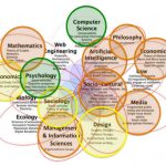
Which leads me back to getting Spiderman into the course. Ben Shneiderman’s eight golden rules of interface design, are expected to make an appearance in any self-respecting HCI course. I know I have been referencing them here for many, many years, well before I thought of an udemy course in those long lockdown days. Alongside which, I will have to add Don Norman’s seven principles of UX, Jakob Nielson’s 10 usability heuristics, Alan Dix et al’s principles, Jenny Preece et al’s interaction design principles, and so on and so forth. And, I will include Brenda Laurel as I find her Computer as theatre ideas compelling, even though I have already used them to discuss social media as theatre.
Last time I did not go through these each of these guides and their rules one by one, I did a mashup instead because they are all very similar and I thought: What is the point of repeating myself?
This is the point:
They are all contributions to HCI literature and need to be looked at in detail, before we get into any mashups. Students need the complete picture, to see the similarities for themselves, before they can even begin to consider a mashup. Preferably they will create their own mashup. Ooooh I can set that as an exercise. Nice!
But first, I just have to lay out the rules lecture by lecture, slides by slides (yawn) or movie by movie, as details are important. So, that the student after learning some relevant cognitive science and design theory, will know what helps when designing dialogue, aka the interaction between the human and the computer. HCI is first and foremost a dialogue – one in which the human and the computer transmit information back and forward to each other in whatever way is most appropriate: text or speech only or visuals only, no sound. There has to be redundancy built into any system to make it accessible and/or if needed, safety critical.
This time round, I will be repeating myself – and building in redundancy – because if I keep repeating myself, I will pass on the fundamentals to my students, as I realised not for the first time, last year when learning to plaster, that the definition of excellence is doing the fundamentals well and I want my students to feel confident doing the fundamentals so that they can do excellence, which was and is the point of creating this course.
Once we have covered the basics, then things will get more interesting, for me anyway, as we explore Dark UX, and how not to manipulate and influence our users into giving away more than they have bargained for. We want to create psychological responsibility but in order to do that, we need to cover the fundamentals of good design first:
The definition of excellence is doing the basics really, really well.
Dr Ruth Stalker-Firth
I stuck my title in there too so you know that you can: Trust me, as I’m a doctor. So! No more mashups, just the excellence of fundamentals. And, now I have a why, I am all fired up to create some lovely lectures on Spiderman and the rest of the HCI-verse and all the rules they’ve made.
My course on Human-computer interaction is available over on Udemy.


One comment